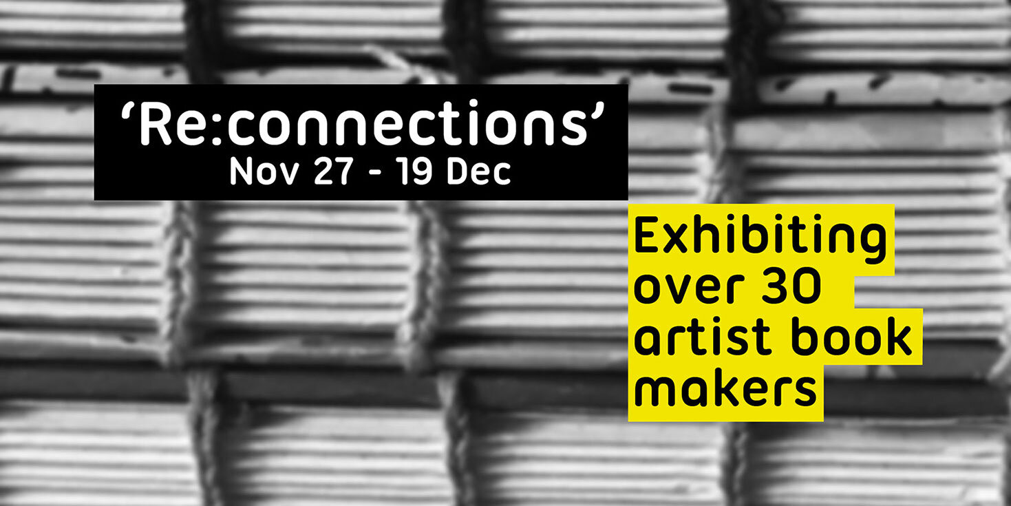
During the lockdown we were all forced to reconsider how we could best keep connected with people and life in general. Artists were not exempt from this challenge. Many had to rethink how they physically carried out their work, what their works meant and how they connect with their audience in an unprecedented time. This exhibition will show artist books on the theme of connections - past, present and future.
The Perpetua Press
At the beginning of June 2020, I was flattered to receive an invitation from my old friend, Richard Wilson, to take over proprietorship of The Perpetua Press. Sadly, Richard was in the terminal stages of the cancer which was to claim his life before the end of August, so he was understandably keen to ensure the continuity of the Press before his time ran out. He, in his turn, had inherited this from his father-in-law, Vivian Ridler, via Hugo Brunner (a former collaborator with Vivian and Lord Lieutenant of Oxfordshire between 1996 and 2008). During his short time in charge of the Press, Richard was able to publish one book in association with the Oxford bookseller, S.P. Tuohy, Some Book Decorations by Berthold Wolpe, Discovered in a Collection of Line Blocks Belonging to his Friend, Vivian Ridler. The transfer of ownership was effected by the simple deposit of a ‘bun penny’ (a penny with a profile of Queen Victoria sporting a bun) – alas, in digital format only as no such physical coin could be obtained in the time available.
The Perpetua Press was first established by Vivian Ridler with his friend David Bland in 1931 (David Bland went on to become Production Manager for Faber & Faber). One year, their Fifteen Old Nursery Rhymes was chosen as one of the 50 best books of the year. Vivian’s interest in printing and typography had begun while still at Bristol Grammar School. During that time, he met Eric Gill and Douglas Cleverdon and went on to serve an apprenticeship at E.S. and A. Robinson. After a promising freelance career, he later joined Oxford University Press, firstly for a brief period between 1937 and 1938, and then again at the invitation of Charles Batey from 1949 until his retirement in 1978, being promoted to Printer to the University of Oxford from 1958.
After his retirement from OUP, Vivian returned to the Perpetua Press in earnest, where he continued to print a series of exquisitely produced publications on his hand-press, which included books (often in collaboration with his wife, the poet, Anne Ridler), as well as broadsides and other types of ephemera. Due to the demise of letterpress printing in the late 1970s, he had been able to build up a substantial selection of typefaces, one of his favourites being Bembo – which name he coined to good effect for a set of comic verse by his former colleague, OUP editor John Bell, lampooning publishing and entitled Mutiny on the Bembo. An exhibition of some of his work was held at The Ruskin School of Drawing and Fine Art in Oxford University in 1993.
I had known the Ridler family since being introduced to them by my aunt in the mid-1970s. Having myself been one of the last generation to be trained in hot-metal composition at the London College of Printing (as it then was), by happy coincidence it turned out that my first boss in publishing, John Robson, had himself sat the City & Guilds examination in typography under Vivian’s aegis – Vivian at the time being a part-time lecturer in typography at the Royal College of Art. During the 1980s, John Robson had a regular lunch date in Oxford with Hugh Williamson, author of Methods of Book Design, which Vivian sometimes joined – and to which I was also on occasion invited. My association with Vivian was therefore both a personal one and to some extent professional.
Soon after Vivian died at the age of 95 in 2009, Richard Wilson had overseen disposal of the printing equipment so that there were no longer any physical assets associated with the Press by the time I took it on. However, the imprint has a distinguished pedigree which I am particularly keen to maintain. I have for many years admired the output from John Randle’s Whittington Press, having been one of the original subscribers to Matrix. During the Whittington Press Open Day in 2019, I was privileged to see early proof sheets from 2020 Vision, demonstrating the Press’s immaculate printing of wood engravings from the original block – some of which entailed a particular challenge, being over 100 years old. (Much of the printing was carried out by Anna Parker, who has been working at the Whittington Press as an unofficial ‘apprentice’ for the last 2 years.) It so happened that I already had an association with Pat Randle, having recently invited him to speak at a meeting of Letter Exchange, the association for professionals in the lettering arts. I am delighted that Pat has agreed to be responsible for printing the posters and is now an enthusiastic contributor to the project.
Exhibition preview
‘Lettering: Art & Illusion’ Ruthin Craft Centre, 19 October 2019-12 January 2020

Exhibition review
Precipitous City, bound : unbound
Upright Gallery, Edinburgh, 16 August-6 September 2019
The Upright Gallery is a tiny independent exhibition space, set up by Ian Farmer in April 2017, who also runs a graphic design business from the premises. His curatorial policy is driven by his personal predilections – support for newly qualified artists, work that carries a sense of integrity, sometimes with an element of social commentary and often with a strong narrative thread.
The show takes as its starting point an extract by Robert Louis Stevenson from 1878 in which he describes the city of Edinburgh: ‘From her tall precipice and terraced gardens she looks far and wide . . .’ It is a collaboration between five Edinburgh-based book artists comprising Felicity Bristow, Liza Green, Susie Leiper, Lynda Wilson and Susie Wilson, known collectively as ‘bound : unbound’ (note the lower case).
Each artist has responded to the city in their own particular way and using a range of media – printmaking, textiles, calligraphy and painting. Although text was the inspiration for the show, the result is highly visual, with ‘books’ being by no means the only object-type on display.
This is consistent with the ‘unbound’ part of the group, which has been in existence since 2014 when they were selected for the Hidden Door Festival which took place in the disused vaults below Waverley Station, although the group’s title only came into being in 2017.
I particularly enjoyed a collagraph print by Liza Green, ’10 to Tollcross’, with its pale greys and small points of red emphasis and which appears to be inspired by an aerial view of this particular area of the city, while the book format is given a unique twist by Felicity Bristow, whose ‘Ticket collector’ is a concertina booklet made up of used train tickets.
But perhaps the most satisfying contributions are those by Susie Leiper, who manages to combine a painterly approach with skilful calligraphy. Text is present in most of her work, although so successfully integrated into the overall image that it frequently requires careful study in order to be decoded.
This is particularly difficult to achieve as the linear nature of calligraphy often sits at odds with the tonal properties of painting, the two forms representing different grammar types. On the other hand, Leiper’s use of the brush and graphite, or lettering using colours that blend with the background, help to soften the texture of the writing and thus achieve a consistent tonal range.
The blending of form and content is particularly successful in ‘Sic itur ad astra, this way to the stars’ (oil, casein paint, metallic papers, silverpoint and graphite on wood). This is based around an article written by G.K. Chesterton for the Daily News in 1905 where he talks of the abruptness of Edinburgh, and that ‘it seems like a city built on precipices: a perilous city.’ ‘Sic itur ad astra’ is the motto that was carved or painted on the Canongate, suggesting that Edinburgh is ‘this way to the stars’.
Leiper brings together her Chinese influences with a direct reflection on ‘Elephant Hill – Arthur’s Seat’ (oil and Dr Martens white on board, bound as a concertina book). The text in this piece comes from Chiang Yee’s A Silent Traveller in Edinburgh, one of a number of highly educated Chinese who travelled around the UK in the 1940s.
One side of the book is left text-free – an image of Arthur’s Seat in all its greenery. The other side has a bluer effect, with spontaneously written text extracts placed so as to reflect clouds perhaps – the handwriting style suggestive of the author’s personal impressions.
These are exquisite objects – not only to look at, but happily to hold and to feel.
Book review
Paul Stirton
Yale University Press and Bard Graduate Center, New York
2019, ISBN 978-0-300-24395-6, Paperback, 254 pp., 8¾ x 7”
£25
Throughout his early career, Jan Tschichold had been a diligent collector of Modernist printed material and ephemera in support of his advocacy for the New Typography. However, in 1937, when he was surviving on a modest income from teaching and occasional design work following his flight from Nazi Germany to Switzerland, he decided to sell a substantial cache of 60 posters from his collection to the Museum of Modern Art in New York.
After the war in 1950, he again offered another significant batch to MoMa. The resulting collection contains several hundred items and includes work from many of the luminaries of the Modernist movement, such as Theo van Doesburg, Aleksandr Rodchenko, Piet Zwart, Max Burchartz, El Lissitzky, László Moholy-Nagy, Kurt Schwitters, Herbert Bayer, Max Bill, Cassandre and Tschichold himself.
This book is published in conjunction with an exhibition of the same title held at Bard Graduate Center Gallery in New York City from 14 February to 14 July 2019, based around the above collection. It opens with a brief recapitulation of Tschichold’s well-known early career up to the point in the late 1930s when he was beginning to question his espousal of the New Typography. It contains a well-presented discussion of the key political and artistic movements of the time relating to the Modernist project, such as Constructivism, Suprematism, Dutch Neoplasticism and Futurism. It covers the influence of the New Typography outside Germany, including the impact of the forced exile of some of its key practitioners, and concludes with a selection of extracts from primary texts by its various exponents.
Although a talented calligrapher, it is well known that Tschichold focused on typography, partly under the influence of the Bauhaus and its increasing orientation towards uniting art and industry following its earlier Arts and Crafts impetus. A key intellectual feature in the literature of the period was an espousal of the machine, and the potential political benefits of the industrial process. The growth of the New Typography was in turn fuelled by developments in printing technology and the related drive towards standardization (such as DIN 476 setting out A sizes in paper in 1922).
I had not fully appreciated how important the ability to integrate half-tones with text was to the New Typography – the photograph being seen as the archetypal ‘industrial’ means of illustration as opposed to the traditional woodcut. I was also intrigued to learn how important the growth of the advertising industry was to Modernist designers, despite their predominantly left-leaning philosophy – for example, this from Lajos Kassák in 1928: ‘If our designers and typesetters grasp . . . the essence of elementary typography, it will be easy to demonstrate . . . that the modern advertisement is . . . one of the most effective mediators between production and consumer markets.’
The book is well illustrated with many unfamiliar examples (all well placed near their text citation) and forms a useful addition to the literature covering this immensely creative period in the history of typographic design.
Writing: Making your Mark, The British Library, 26 April-27 August 2019
We live in a world characterized by the apparent explosion in the digital means of communication. For some, this suggests that the physical act of ‘writing’ as it has been handed down over the generations is becoming an increasing irrelevance. And yet, as Ewan Clayton points out in the book which accompanies the exhibition, we should beware of simplistic assertions that overlook the rich ecology of writing tools that are developing.
In this impressively ambitious exhibition, Clayton and a small team of curators from the British Library have assembled a collection of around 100 objects in order to ‘learn more about different writing systems across the globe, appreciate the beauty of writing where functionality and aesthetics meet, and feel empowered to enter the debate about its future.’
The exhibition is grouped thematically into five main sections. ‘The origins of writing’ contains examples showing how writing emerged in Mesopotamia at some point during the late fourth millennium BC, but also at other times in Egypt, China, the Indus Valley and the South Pacific.
The section headed ‘Writing systems and styles’ shows the development of scripts such as the Roman cursive of a scroll from Ravenna of AD 572, the Anglo-Saxon Insular Half Uncial of the Lindisfarne Gospel of AD 700, the 14th century formal Gothic of the Gorleston Psalter, together with early printed books such as Nicolas Jenson’s printed Cicero of 1470 and Aldus Manutius’ Virgil of 1501 – both juxtaposed with their incomparable handwritten forebears.
The section, ‘Materials and technology’, opens with Annet Stirling’s carving of a Jeanette Winterson poem and includes, amongst other things, a 1900-year-old pottery shard on which is brush-written a Greek sex worker’s licence to ply her trade!
Different types of instructional aid are displayed in the section, ‘People and writing’, such as a 2000-year-old wax tablet showing a student’s (faltering) attempt to copy the master’s Greek exemplar. Of particular interest are Mozart’s handwritten record of his compositions, James Joyce’s notes for Ulysses, and – heartbreakingly – Captain Robert Scott’s last entry into his notebook, ‘For God’s sake, look after our people.’
The section concludes with examples of some different uses of writing – for example, as a source of protest (recent graffiti from Syria), or as an expression of community, as exemplified by a video of the impressive French/Tunisian graffiti artist, eL Seed, who movingly describes his work as ultimately about the connections it has enabled him to form with other people – echoing Martin Buber’s comment (quoted by Clayton elsewhere) that ‘all real living is meeting’.
The exhibition ends with a video recording of various anonymous individuals offering their reflections on the theme, ‘The future of writing’.
The curators have made the commendable effort not to tax the viewer with over-elaborate descriptions of the pieces on display. However, this runs the risk that historical and socio-political context is at times lost. Anyone attending the exhibition would therefore be well advised to purchase the accompanying book, which amplifies in considerable detail the main themes of the exhibition and contains fine essays by Clayton and Stan Knight amongst others.
Book reviews
Walter Gropius: Visionary Founder of the Bauhaus
Fiona MacCarthy, Faber & Faber, 2019, ISBN 978-0-571-29513-5
Hardback, 548 pp., 9¼ x 6¼”, £30
Josef Albers: Life and Work
Charles Darwent, Thames & Hudson, 2018, ISBN 978-0-500-51910-3
Hardback, 352 pp., 9¼ x 6¼”, £24.95
Bauhaus Goes West: Modern Art and Design in Britain and America
Alan Powers, Thames & Hudson, 2019, ISBN 978-0-500-51992-9
Hardback, 280 pp., 9¼ x 6¼”, £24.95
Interest in the Bauhaus and all it stood for has long outlasted its brief lifetime from 1919 until suppressed by the Nazis in 1933, as evidenced, for example, by the recent Tate Modern retrospective of the weaver, Anni Albers. However, as Alan Powers persuasively argues, ‘everyone finds the version of the Bauhaus they are seeking, either as a positive or a negative value.’
These three elegant books, published to coincide with the centenary of the founding of the Bauhaus, provide considerable insight into the personalities involved, and their contributions to the continuing legacy of the Bauhaus. Fans of Fiona MacCarthy’s previous biographies of Eric Gill and William Morris will not be disappointed, while Charles Darwent provides a fascinating insight into the notably reticent Josef Albers. Alan Powers is more concerned to unpack the mythology of the Bauhaus and its impact on the theory and practice of design following the diaspora of some of its leading lights, with particular focus on the UK and the US from the 1930s to the present day.
When Walter Gropius arrived in London in 1934, his opportunities for work having evaporated under the Nazis, he was preceded by his considerable reputation both as the founder of the Bauhaus and also as the designer in 1914 of such modernist icons as the Fagus Factory, Alfeld-an-der-Leine.
And yet, despite teaming up with the architect, Maxwell Fry, his time in England was not a commercial success, with relatively few realized commissions. There was little real understanding of modernism at that time, and as Anthony Blunt was to remark in a Spectator article on 2 August 1935: ‘The Englishman in general dislikes functional architecture – the buildings of Le Corbusier, Gropius, Mendelsohn and the rest – because they are not homey.’
Gropius was more successful in the US, where he had been invited to head the newly formed Graduate School of Architecture at Harvard University in 1937 – a position he managed to combine until his resignation in 1952 with setting up and active participation in The Architects’ Collaborative (TAC). Thereafter, he appears to have spent the remainder of his life continuing to promote the ideas of the Bauhaus, and his own role in it.
A minor criticism of MacCarthy’s book is that, as in her previous biographies of Gill and Morris, she is arguably seduced by her subject (who she met in the penultimate year of his life in 1968), and is thus inclined to be less critical of some of his more questionable achievements, such as the controversial Pan Am building in New York. However, she is concerned to reveal the man behind the reputation, chronicling amongst other things his several passionate love affairs and his unlikely first marriage to the self-serving Alma Mahler. She also shows how true he remained to his original principles. The initial Bauhaus manifesto in 1919 owed a clear debt to Morris and Ruskin: ‘There is no essential difference between the artist and the craftsman. The artist is an exalted craftsman. In rare moments of inspiration, transcending the consciousness of his will, the grace of heaven may cause his work to blossom into art.’
Throughout his life, Gropius went on believing in the essential nature of art, promoting the values of community and good living as the true goal of architecture. In so doing, he was opposed to the notion of the ‘starchitect’ as exemplified by the likes of Frank Lloyd Wright or Le Corbusier. As Sally Harkness, one of his TAC colleagues, was to say: ‘Everyone wants to think of him as one of the world’s great architects; he wasn’t. He was one of the world’s great philosophers.’
The Bauhaus existed in a more or less permanent state of financial and inter-personal crisis – ameliorated to some extent by Gropius’ ability to throw a memorable party. But of course the greatest challenge was political once the Nazis started to grow in power following the surprising cultural flowering that took place in Germany immediately after the First World War, of which the Bauhaus itself was an example.
Gropius himself was at pains to remain apolitical (although personally opposed to the Nazis, he did necessarily accept some architectural commissions from them after he had left the Bauhaus in 1928). However, his successor at the Bauhaus, the architect Hannes Meyer, promoted an openly Marxist agenda, gradually revealed only after Gropius’ departure. And it was Josef Albers – a determined ‘non-joiner’ throughout his life, who resisted any kind of political alignment – together with Kandinsky who played a significant role in Meyer’s eventual removal, by controversially denouncing him to the authorities at a time of acute political sensitivity when there was an increasingly hostile National Socialist faction on the Dessau city council.
It seems that one can legitimately ask how successful the Bauhaus was in its stated aim of combining art and technology, and in somehow linking handwork with mass production techniques. Yet it is perhaps in Albers’ work that we see the closest attempt at a reconciliation. Between 1950 and his death in 1976, Albers created more than 2000 paintings in the series that was to define him as an artist, ‘Homage to the Square’. Darwent argues that there is a mechanical element to this infinite variation on a theme. Furthermore, the materials used in each painting are meticulously described on their reverse so that they could, in theory, be repeated by anyone. And yet, for Albers, ‘colour was an analogy of human behaviour and this led him to a belief in the inescapable moral function of art’.
Of the three books, that by Alan Powers is the most questioning of his subject. He shows persuasively how some of those most concerned with promoting the Bauhaus ideals (such as Niklaus Pevsner or Herbert Read), were responsible for creating another kind of fiction. According to this narrative, the Bauhaus emerges ‘as a kind of zombie, capable of deceiving people into believing it was the real thing, while actually a caricature and oversimplification of the complex original. This zombie is still walking the planet . . .’
Powers brings his considerable erudition and knowledge of the contemporary cultural scene that existed at the time when some of the ‘big beasts’ of the Bauhaus (Gropius, Van der Rohe, Moholy-Nagy, Breuer, etc.) were forced into exile, and charts the complex reaction to the modernist project that took place during that period and in subsequent years. In so doing, he also reveals some of the dichotomies that existed both in actuality and in the self-promotion of the Bauhaus, and sets out a rational assessment of its successes and failures, at one point suggesting that the Bauhaus was, ‘in many ways better adapted to the new world of branding, corporate identity and promotion than to the Platonic quest to cross the chasm between art and industry while leaving the purity of art intact.’
Of all the characters described, perhaps ‘that lovely madman’ (to quote Jack Howe), Moholy-Nagy, comes across as the most interesting for our times in view of the impending global ecological crisis we face. In his posthumously published Vision in Motion (1947), he argues for the interrelatedness of all aspects of man’s fundamental nature, including our relations with the natural world, and coins the intriguing concept of the ‘biotechnical’ to explore, amongst other things, how human technology is in fact based on natural processes.
Letter Exchange members will be particularly interested in the brief account of Anthony Froshaug’s time teaching at the Hochschule für Gestaltung (HfG) in Ulm from 1957 to 1961. The HfG had been established in 1946 as the self-declared ‘successor to the Bauhaus’, with Max Bill as Director from 1951. Froshaug had been influenced by Jan Tschichold’s New Typography (famously repudiated by Tschichold in a fierce exchange with Bill in 1946 – interestingly not covered by Powers), while Tschichold himself had previously been inspired by the 1923 Bauhaus exhibition.
Perhaps Froshaug may be permitted the last word in describing what made the HfG (and, by extension, the Bauhaus) so special: ‘. . . in spite of the internecine conflicts among the staff, in spite of the blinkered attitude of the formalists, the dilettantes, the romantics, the contract-hunters, in spite of all friendly and all inhuman tendencies – the mixing of nationalities, professions, abilities and cultures in the foundation course produced incredibly high standards of thinking and presentation, both among staff and students.’
All three books are intelligently designed and contain a generous number of colour illustrations. The MacCarthy and Powers books also print coarse-screened black and white halftones on the uncoated text paper, lending the books an artefactual quality consistent with their subject matter.